Balancelogic’s Brand Identity
THIS IS WHO WE ARE!
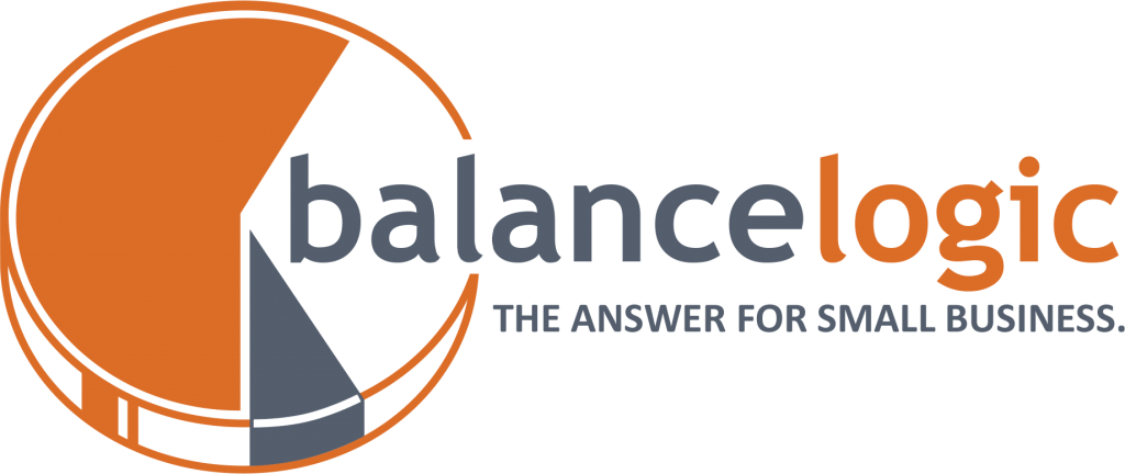
In our case, the circle or the pie represents our client’s business and the slices of the pie represent the services that Balancelogic offers. The result being that by partnering with Balancelogic, we help complete your business, making it whole, making it successful. Additionally, the sizes of the slices of the pie represent the relationship between Balancelogic and our clients, whereas, our team can work with you to become either a small part of your business or a large part.
TYPOGRAPHY
NAME / HEADER

TAGLINE / SUB HEADER

BODY

VARIATIONS

WHITE BACKGROUND

ORANGE BACKGROUND

SLATE BLUE BACKGROUND

GRAY BACKGROUND
LIGHT GRAY BACKGROUND

PATTERN

LIGHT IMAGE

DARK IMAGE

GRAYSCALE

COLOR ON BLACK

BLACK ON WHITE

WHITE ON BLACK
COLORS
Orange signifies creativity, adventure, success, determination and is both physically and mentally stimulating.
It combines the happiness of yellow and the energy of red. It is often associated with enthusiasm, creativity, success and encouragement. Orange also is associated with rejuvenation, optimism and motivation.
Slate Blue signifies importance, stability, unity, dependability, and is considered to be an excellent color
to represent skills, knowledge, and prosperity.
When these two colors are combined, the result is the perfect balance between taking a risk and reaping the reward having the confidence that you have trusted Balancelogic with this task, and knowing that we take each client’s needs very seriously.

TAGLINE
CALIBRI BOLD – UPPARCASE – SLATE BLUE
CALIBRI BOLD – UPPERCASE – ORANGE
CALIBRI BOLD ITALIC – TITLE CASE – SLATE BLUE
CALIBRI BOLD ITALIC – TITLE CASE – ORANGE
PATtern

CORPORATE STATIONERY

